


2024 has arrived, and the ecosystem of React component libraries remains thriving. This article will dissect two currently popular component libraries from several perspectives, providing an objective analysis to help users make informed choices.
Why Choose a Component Library?
In general, companies choose a component library when building web applications to streamline repetitive work. Component libraries offer ready-to-use components such as Select, Input, CheckBox, etc., allowing users to create beautiful websites quickly without the need to build extensive foundational features from scratch.
To summarize, component libraries are typically used in two scenarios:
External Tools: Directly facing company users, often with a company's distinct style, emphasizing aesthetics and responsiveness.
Internal Tools: For internal use by company employees, focusing on aesthetic design and rapid functionality implementation.
Next, we will analyze two component libraries based on the following criteria:
Design
Richness of Features
How to Choose for Different Scenarios
Other Options for Internal Tool Scenarios
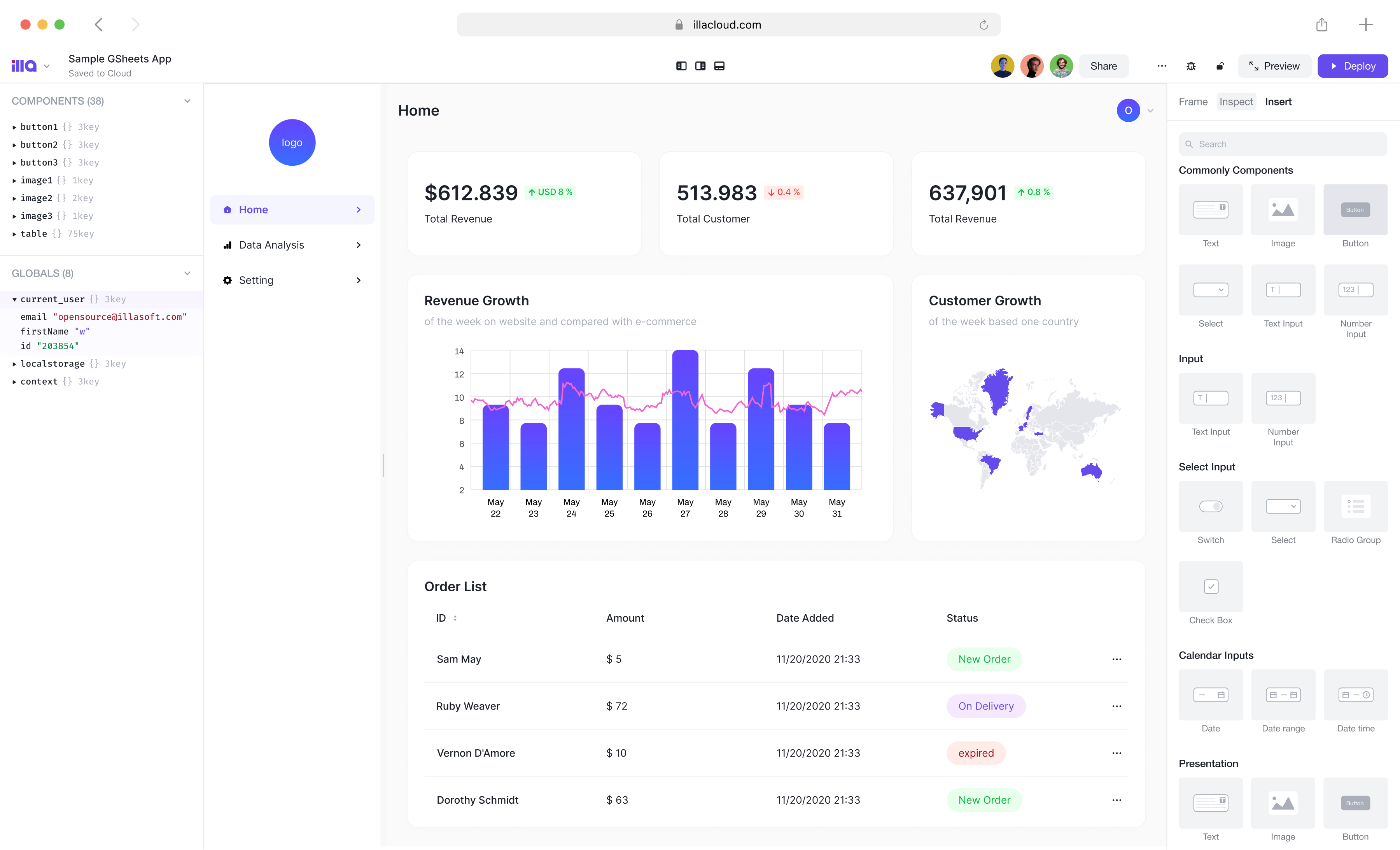
ILLA Cloud is a ready-to-use low-code tool that allows for the quick construction of internal tools using simple JavaScript without the need to create new projects.
Web & App Admin Panel
Data Dashboard
Customized B2B Tools
Compared to building scenarios with component libraries, ILLA Cloud enables 10x faster tool construction and supports collaboration among team members for simultaneous editing.
Features of Shadcn UI
Some detailed data about Shadcn:
⭐ Github Stars: 37k
⏬ NPM Downloads: 23,962 downloads per week
💪🏼 First Release Date: Mar 8, 2023
Shadcn UI is a relatively new project that gained impressive recognition, achieving 37k stars in less than a year. It seems that outstanding open-source projects can easily gain widespread approval.
Design
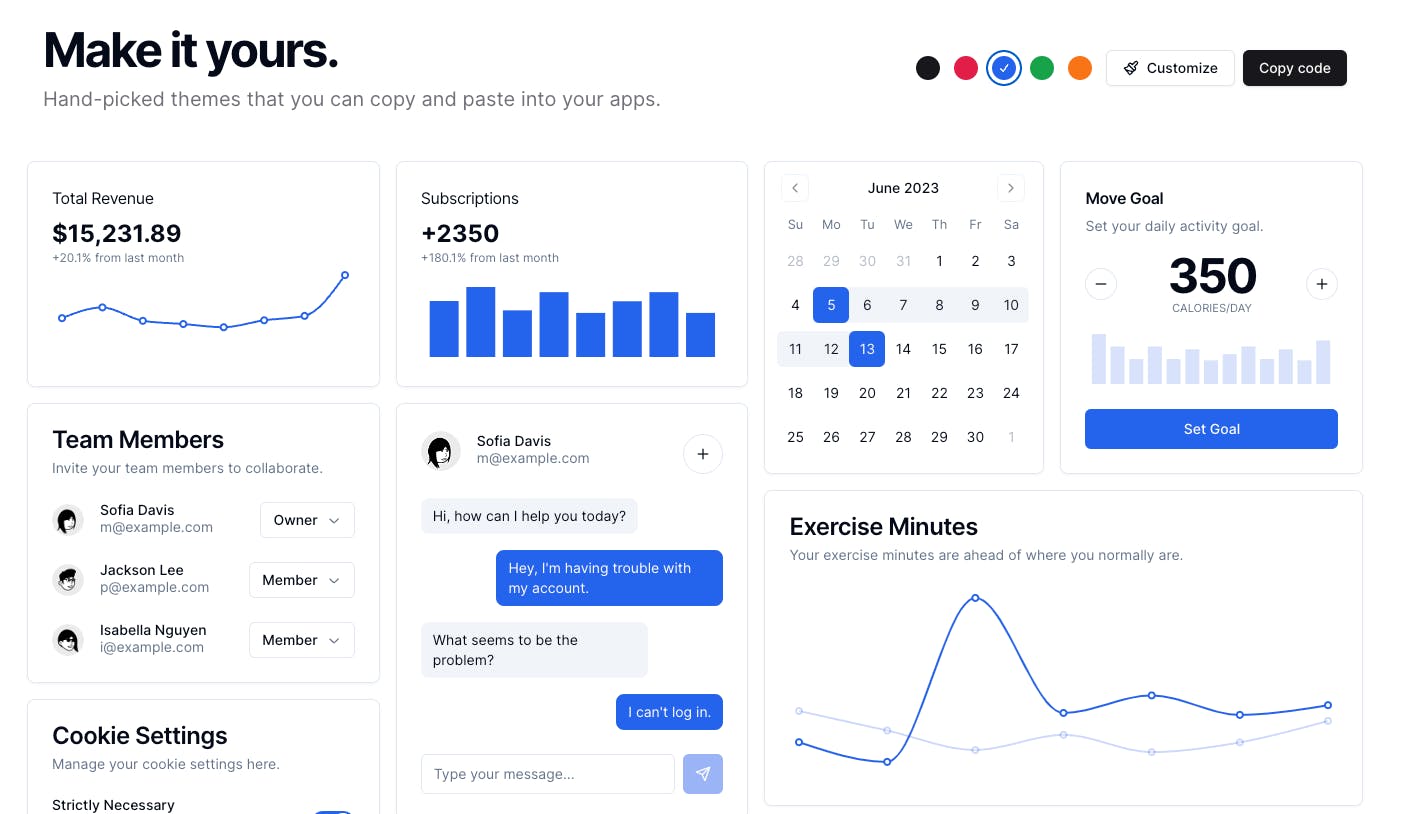
Shadcn UI leans towards a business style in its design, featuring a clean UI suitable for internal tools and serious application scenarios. Shadcn UI also supports custom themes, although it seems limited to:
Colors
Rounded corners
Dark mode / Light mode
Predefined "Default Style" and "New York Style"
In terms of design details such as font and font size, the control appears limited, satisfying basic design needs. However, for external tool scenarios, it may have some limitations.
Shadcn UI supports both CSS and CSS-in-JS solutions. The CSS-in-JS solution uses Stitches, and while CSS defaults to traditional CSS, additional configuration may be needed for less and sass, and it is not out-of-the-box.
Richness of Features
The library's richness of features is sufficient for daily development needs, supporting and providing complete callbacks for most capabilities. Shadcn UI supports essential capabilities, including but not limited to SSR, accessibility, and animation. For more advanced requirements like extremely rich charts and high-performance tables, it seems not fully supported, but ongoing project development is likely to address these needs.
Features of MUI
Some detailed data about MUI:
⭐ Github Stars: 90k
⏬ NPM Downloads: 3,263,852 downloads per week
💪🏼 First Release Date: Nov 6, 2014
As an established project, MUI has been maintained since 2014, boasting almost 10 years of stability. The high number of stars and weekly downloads ensures a continuously active community.

Design
In terms of design, MUI strictly adheres to Google's well-known Material Design. MUI offers extensive customization capabilities to meet most internal and external scenarios, with many well-known open-source projects using MUI for frontend development. For most functionalities, MUI provides comprehensive support.
In addition to common features like colors, rounded corners, and dark/light modes, MUI supports complete customization of fonts, font sizes, colors, padding, and margins. As a project with ten years of development, MUI's functionality is powerful.
In terms of CSS support, MUI has its custom system, using emotionjs for style adjustment in the overall layout. This may involve a learning curve and may not be as developer-friendly, requiring documentation consultation for some style modifications.
Richness of Features
MUI categorizes its components into several dimensions:
MUI Core: Basic functional components and a style system.
MUI X: High-performance and complex components, including high-performance tables, charts, etc.
For developing a complex system, you can use MUI's comprehensive solution. However, MUI X is a paid component library, requiring a subscription fee.
MUI is a heavyweight repository with extensive code and a long maintenance history, offering high customizability, making it suitable for large projects. The repository contains numerous features.
How to Choose
If you are a curious open-source enthusiast who does not need highly customized UI for product development, and there are no complex data processing requirements, Shadcn UI is recommended. It is more lightweight, simpler to configure, but less powerful. However, it is sufficient for internal tool scenarios.
If you need a component library for developing large and complex projects, require intricate charts, high-performance data components, and are willing to invest in a fee without looking for additional solutions, you can choose MUI. Its powerful capabilities make it an excellent choice for developing medium to large projects.