

It's 2024, should I choose Shadcn UI?

Refactor everyone's work.
Official Website: http://illacloud.com
GitHub Repo: http://github.com/illacloud/illa-builder
2024 has arrived, and the ecosystem of React component libraries remains vibrant. This article will dissect two currently popular component libraries from various perspectives, providing an objective analysis to help users make more informed choices.
Why Choose a Component Library?
In general, companies choose a component library when building web applications to streamline repetitive tasks. Component libraries offer a range of out-of-the-box components like Select, Input, CheckBox, etc. These components, with customizable styles or built-in attractive styles, enable rapid development of aesthetically pleasing websites without starting from scratch.
In summary, we typically use component libraries in two scenarios:
External tools: Directly facing company users, usually aligned with the company's style, more aesthetically pleasing, and responsive.
Internal tools: Aimed at internal use by company employees, emphasizing design aesthetics and rapid functionality implementation.
Next, we will analyze the Shadcn UI component library based on the following points:
Design
Richness of Features
How to Choose in Different Scenarios
Other Choices for Internal Tool Scenarios
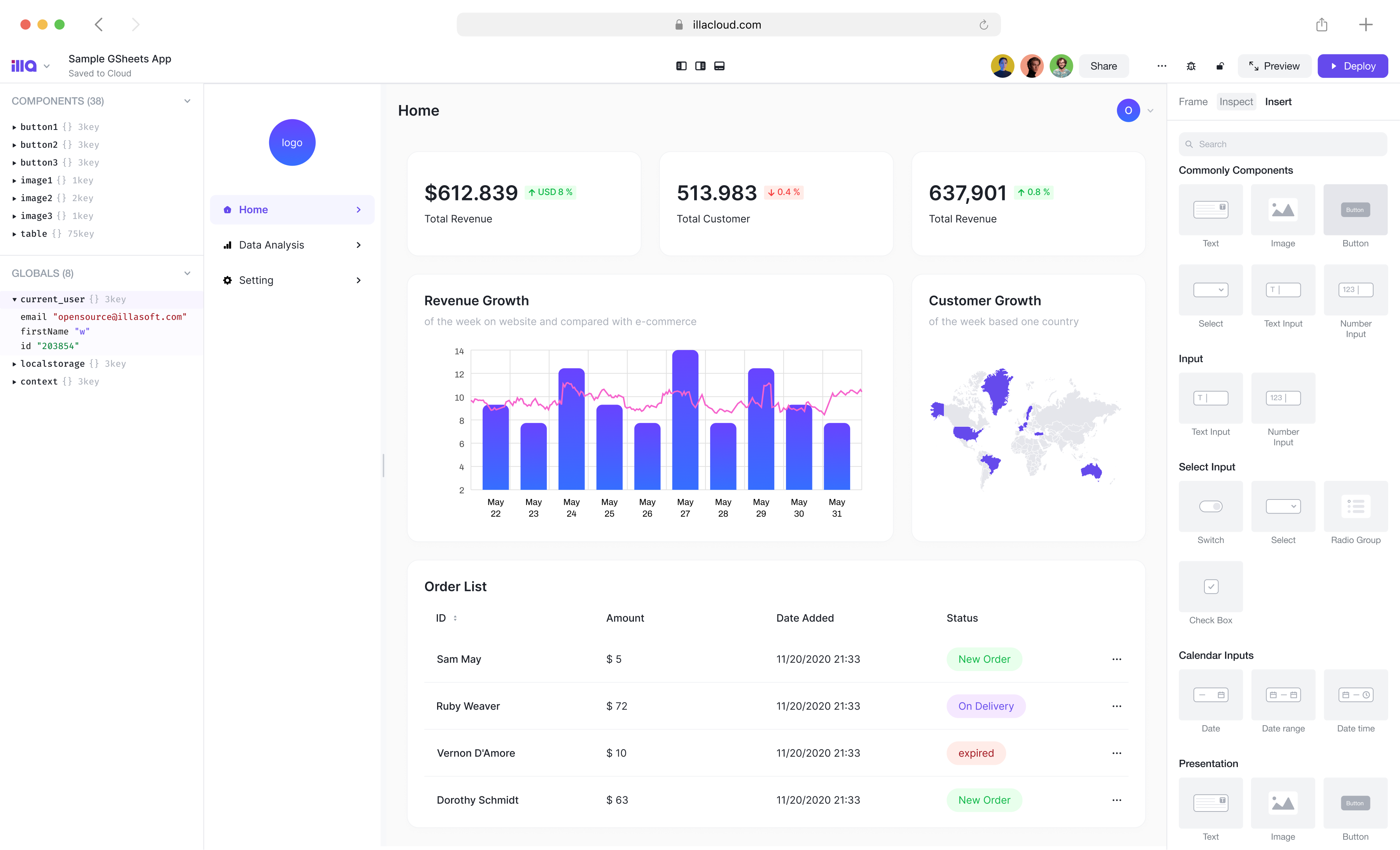
ILLA Cloud is an out-of-the-box low-code tool that allows quick construction of internal tools with simple JS, without the need to create new projects.
Web & App Admin Panel
Data Dashboard
Customized B2B Tools
Compared to building with a component library, ILLA Cloud enables 10x faster tool construction and supports collaborative editing within teams.
Features of Shadcn UI
Some detailed data about Shadcn:
⭐ Github Stars: 37k
⏬ NPM Downloads: 23,962 downloads per week
💪🏼 First Release Date: Mar 8, 2023
Shadcn UI is a relatively new project that gained 37k stars in less than a year, indicating its rapid recognition in the open-source community.
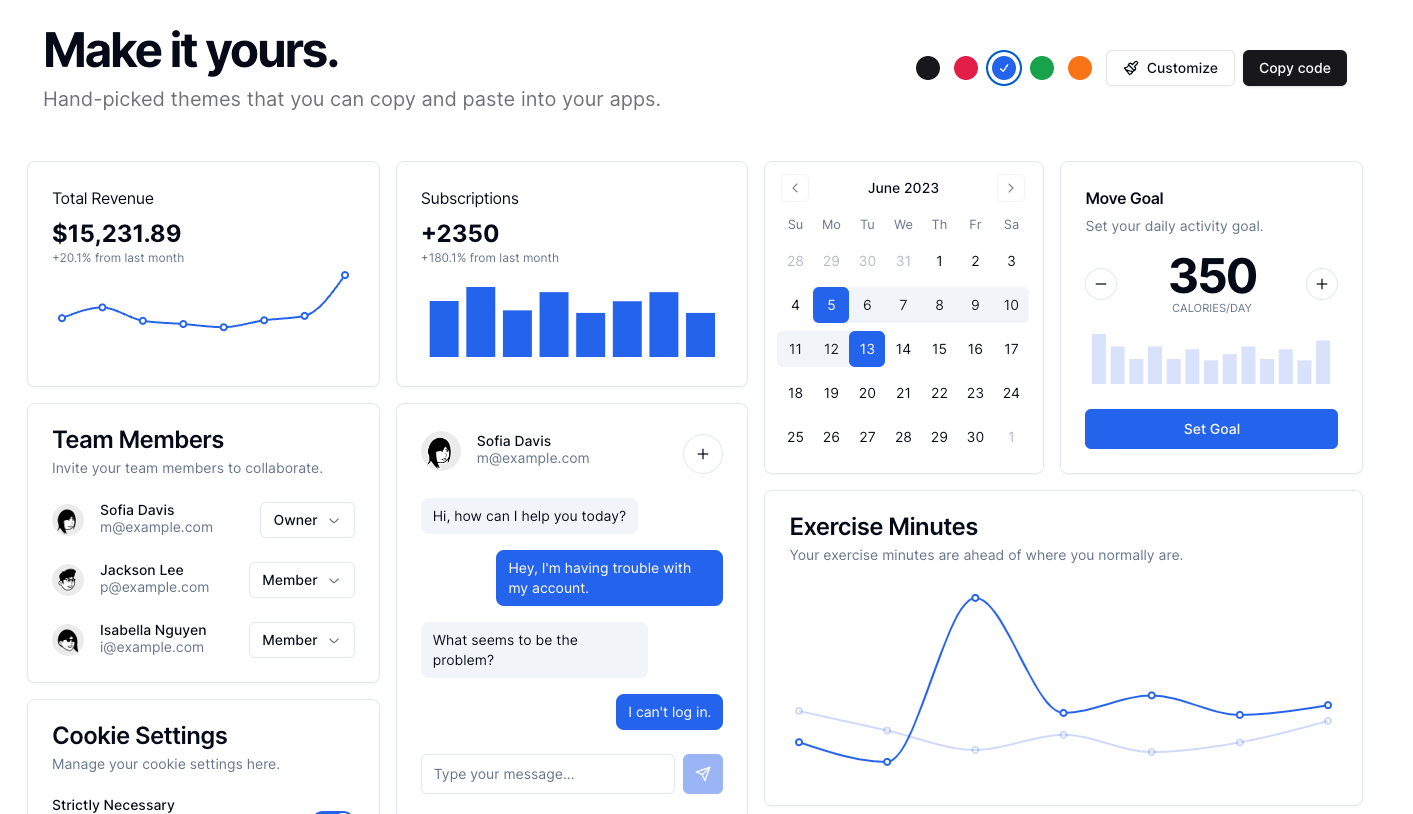
Design
In terms of design, Shadcn UI leans towards a business style with a clean UI, suitable for internal tools and serious application scenarios. Shadcn UI supports custom themes, but it seems to offer customization only for:
Colors
Border radii
Dark mode / Light mode
Predefined "Default" and "New York" styles
In terms of fine-grained control, such as font and font size, it appears to lack flexibility. However, for internal tool scenarios, this level of control may be sufficient, but for external tools, it might be somewhat limiting.
In terms of CSS, Shadcn UI supports both traditional CSS and CSS-in-JS, using Stitches for the CSS-in-JS solution. Traditional CSS is supported by default, but additional configuration might be needed for less and sass, and it's not out-of-the-box.
Richness of Features
The library's feature richness completely satisfies daily development needs, with most capabilities supported and comprehensive callbacks. Shadcn UI supports crucial capabilities, including but not limited to:
SSR
Accessibility
Animation
However, for more advanced requirements like extremely rich charts and high-performance tables, it seems not to be supported. With the continuous development of the project, it is expected that the project will evolve over time.
How to Choose
✅ Advantages
If you are a curious open-source enthusiast, not requiring highly customized UI, and without complex data processing needs, Shadcn UI is recommended for development. It is lightweight, with simpler configuration, ready to use out-of-the-box, allowing direct development without worrying about details.
❌ Disadvantages
If you have a high need for UI and component customization and plan to use Shadcn UI for large projects, it is not recommended. Shadcn UI's customization capabilities are not as robust, and it does not provide out-of-the-box charts and high-performance data components. In such cases, you may need to look for other open-source projects to supplement these features.


